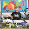
It’s not good-bye but au revoir for the Flamingo Clay Studio, 15 S. J St., in Lake Worth, which has called that city home for the past two decades. Despite a heroic fight to save their studio and gallery space, the studio has received an eviction notice effective June 7. The nonprofit artists’s cooperative, founded by artist and activist Joyce Brown, 80, also runs the … [Read more...]
Nora Maité Nieves: A sense of play, a sense of home come out in artist’s solo Norton show
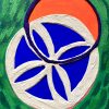
It’s been a big year for Nora Maité Nieves. Her first solo museum exhibition, Clouds in the Expanded Field (Nubes en el Paisaje Expandido), is currently showing at the Norton Museum of Art through July 7. The show is the climax of the two-month artist residency Nieves completed at the museum in January. A month later, in February, an animated version of her paintings aired on … [Read more...]
At the Norton: Simpson’s ceramics link to generations of Indigenous female creators
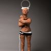
Hailing from a long-line of female ceramicists, Rose B. Simpson grew up in northern Arizona in the Santa Clara Pueblo, (also known as Kha-‘Po Owingeh, or the “Singing Water Village”), a town with a population of fewer than 1,000 residents. The daughter of renowned sculptor Roxanne Swentzell and metal artist Patrick Simpson, Simpson, 41, is an in-demand contemporary mixed … [Read more...]
Kips Bay 2024 house is a knockout of color
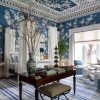
Set foot into the foyer of this year’s Kips Bay Decorator Show House at 230 Miramar Way in the “SoSo” neighborhood of West Palm Beach, and be greeted by a kaleidoscope of color. Nadia Watts Interior Design created the “Lively Loggia and Jeweled Gallery,” a jewel-toned foyer accented with hand-painted turquoise Porter Teleo wallpaper, a mix of antique and contemporary styles … [Read more...]
Artist Wynne makes poetry with poured glass
By Sandra Schulman Hand-poured glass spells poetic words, while embroidered photos tell stories. In a genre he has created and perfected, Rob Wynne is having a survey exhibit at Gavlak Palm Beach, The Underside of a Leaf, of new and historical works. A selection of Wynne’s iconic poured glass pieces is shown alongside his archival “photograms,” and text-based works from … [Read more...]
At the Flagler: Alphonse Mucha, mystical and modern master

By Sandra Schulman The Art Nouveau movement in turn-of-the-century Paris flourished with graceful elaborate lines, embellished flora and fauna, and romantic femme fatales advertising --- cocaine? Rolling papers? Alcohol? Hedonism indeed. The head of this heady movement was Alphonse Mucha, whose work is featured in the exhibition Alphonse Mucha: Master of Art Nouveau … [Read more...]
At Cornell, artist Strosberg reimagines Palm Beach
Sometimes it takes an outsider with a new set of eyes to see what others don’t. The result of that perspective is Belgian-born artist Serge Strosberg’s newest exhibit, Reimagining Palm Beach – Past, Present and Future, on display through May at the Cornell Art Museum in Old School Square, in the main downstairs gallery. Featuring 12 allegorical paintings reimagined for … [Read more...]
Boca Museum of Art’s Lippman to step down in 2025
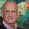
By Sandra Schulman Inca gold. Massive movie backdrops. Glass jaguar heads. These are some of the astonishing art works that have been shown under the stellar direction of Boca Raton Museum of Art’s Irv Lippman, who announced this week he will retire in 2025. He has built a powerful legacy, transforming the museum literally inside and out to become a world-class … [Read more...]
Arts Warehouse artists in the spotlight at Resident Artist Show
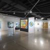
By Lucy Lazarony Sixteen Arts Warehouse resident artists are showing their artwork at the 2023 Resident Artist Show in Delray Beach. The exhibit runs through Jan. 20 and an open studio night takes place January 17 from 6 p.m. to 8 p.m. The exhibition features a variety of media including sculpture, oil painting, ceramics, fashion, and even site-specific murals that will … [Read more...]
Jewelry designer Maeda evokes rare worlds in Morikami exhibit

7.7 billion stories are happening on this planet right now at the same time. These are concurrent and endless stories… You may be happy, sad, full of joy or crying in regret. You may be relaxed, nervous, living an ordinary or unordinary life. Everybody lives this moment of life on this planet, Earth, continuously going around the sun. --- Asagi Maeda With miniature figures … [Read more...]